design
branding
pizzaria gallipoli
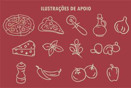
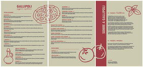
Gallipoli Pizzaria is a dream come true for a pizza-loving couple in Petrópolis, Rio de Janeiro. It began when the husband learned the art of pizza-making at his first job in a bakery. their pizzas are crafted with natural fermentation, premium Italian flour from La 5 Stagioni, and a rich, handmade pelati tomato sauce. the menu combines traditional flavors with creative, high-quality ingredients. Gallipoli’s identity mirrors its essence: sophisticated yet handmade, where tradition meets creativity in every bite.
brewz coffee
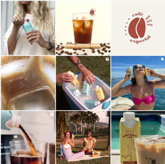
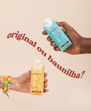
this one have a special place in my heart. Brewz Coffee is not your average cold coffee brand – it’s fresh, fun, and always up for an adventure! designed for festival-goers, music lovers, and outdoor enthusiasts, it’s the perfect pick-me-up that’s vegan, organic, and packed with natural energy. the visual identity brings its playful spirit to life with characters like the astronaut monkey (for the original flavor) and the rollerskate ant (for the vanilla flavor). from catchy claims to vibrant packaging and Instagram-worthy designs, this project was all about creating a brand that’s as cool and bold as the coffee itself!
Panauê
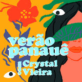
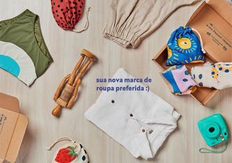
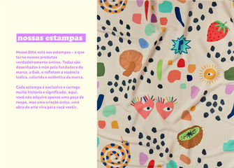
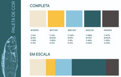
Panauê is all about joy and creativity, and I wanted the visual identity to reflect that. I designed playful, original prints that let me dive into my love for illustration and fashion, bringing the brand’s energy to life. the fun color palette and vibrant elements capture Panauê’s youthful and upbeat vibe, making it a project that’s so close to my heart.
get to know our brand a bit better with the official presentation manual below
JORNAL DO ESTADO DO RIO

we had the honor of being featured in the "Jornal do Estado do Rio", a newspaper from Rio de Janeiro, sharing our story and the journey behind our brand! check out the full article through the link below:
https://www.jornaldoestadodorio.com.br/panaue-moda-criativa-e-consciente/
poá pescados
Poá Pescados is a seafood brand born in the heart of Rio de Janeiro, bringing the freshest fish and seafood to families and restaurants. it's visual identity was crafted to capture the vibrant energy of the sea, the warmth of the sun, and the soul of Rio. using hand-drawn illustrations, I aimed to reflect the brand’s natural and authentic essence all the way.
thai bravo nutricionista
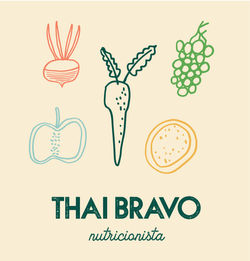
this visual identity was created for a children’s nutritionist who wanted to reflect the heart of her work – nurturing little ones with love and care – while maintaining a sense of professionalism. the design brings together the essence of childhood with playful touches, using elements of healthy vegetables to symbolize growth and vitality. the warm color palette, inspired by fresh produce like oranges, greens, and yellows, captures the joy and energy of a healthy childhood.
desdobra
during the pandemic, I created a sketch of a project to support domestic workers and ironing professionals who were out of work due to COVID-19. the idea was simple but impactful: a service that picked up clothes, ironed them, and delivered them back to people’s homes. the visual identity had to reflect the energy and hope this project brought to so many lives. we chose bright, cheerful colors to balance the seriousness of the situation with a positive, uplifting message of change and opportunity.
bodega records
my boyfriend and I took a vacation to California and Texas, and we wanted to create something special to remember the trip. we decided to capture our adventures in a creative way - so, we dive making Tik Tok and Instagram videos. to tie it all together, we came up with the name Bodega Records.
we wanted a fun and catchy name, full of youthful energy. for the logo, we leaned into primary colors — bright & bold — paired with a playful font that looks like it was written with a marker. the vibe also nods to the aesthetic of a Brazilian street market, adding a personal and authentic touch to the design.


